Saturday, December 13, 2008

Claustrophobia Image Bank

Claustrophobia
Image Bank


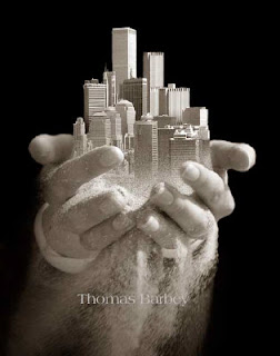
This picture was taken by the photographer Thomas Barbey.
Thomas Barbey is an American photographer who moved to Switzerland at a very young age. After he stopped university he decided to go into the Music world. He was a hit in the Italy and worked with many other people. It was not untill the 1990's when he started a Fashion studio. He does a lot of travelling and his inspirations are Rene Magritte and others.

I really like this picture. I think its so amazing, the way the hand holds the city in its palm, and it is as if the city is made out of sand, meaning that it could crash any second. I feel like this relates to this project because even though this is a city, imagine being surrounded by something and it could just "kill" you in any second. Its overwhelming, and just looking at it makes me feel like I'm in some small little place.

Image Bank # 2


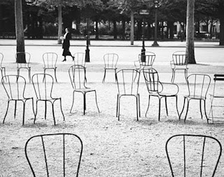
This is my second image which is taken by the photographer Andre Kertesz.
Mr. Kertesz was a Hungarian photographer who probably should have gotten more recognision when he was still alive. He is now a lot more recognized than at the time though.

I love this picture and I also hate it at the same time. The reason I like it so much is because it is so random...A bunch of chairs put together in a park is definatly not something you would see everyday. The reason why I don't like it is because its too messy for me, and that is what makes it claustrophobia to me. I do not mind when things are scattered, but now it just looks messy.


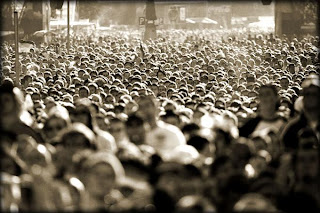
This picture was taken by photographer named Elad Gutman. He was born in 1980 and he is from Israel. He used to be in the Isreali army and was in the photo unit. He then later became a fashion photographer assistant for a short period of time. He now does a lot of freelance, and he gets a lot of oppertunity to travel the world.

The moment I saw this picture I thought it was really good. The first thing I said to myself was "wow" and then i realized how uncomfortable it made me feel. I love being in big cities and having people around me...being alone in the middle of nowhere scares me, but this picture really gave another twist to loving the city and all the people. I feel so claustrophobic when I look at this picture, and I am definatly glad I'm not apart of that crowd. All the pushing and shoving around...? No thank you.


Claustrophobia Printing Compositions

Claustrophobia
Printing Compostions


Aperture: 2.8
Time: 28 seconds


Aperture: 2.8
Time: 120

This picture was scanned in, so I was not able to include the actual whole picture.


Aperture: 2.8
Time: 135


This is the test strip for the picture above.

Aperture: 2.8
Time: 40, 50, 60


Aperture: 2.8
Time: Do not remember the exact time but it is around 140 seconds.


Aperture: 2.8
Time: 70, 75, 80


Aperture: 2.8
Time: 120


Claustrophobia Theory Notes

Claustrophobia
Theory Notes

Picture 1

The first picture that I took was from a class mate and my teacher's daughter. I know I had to convince the teacher to let me use it for claustrophobia, and so this is a perfect chance for me to explain why. Almudena is holding the little girl in her arms, and behind her we can see some sort of gate. This picture does not make me feel claustrophobic, but the setting and the looks of the "models" make it seem as if they are the ones that feel claustrophobic. Some people could interperate this picture as if the two people are scared and afraid, which is technically correct because if a person is feeling claustrophobic, they usualy don't look very happy.
When I was taking this picture, I really tried to take it at diffent angles, but I decided to just go for the direct angle, so their feelings would not be "hidden". I also really tried to get the bars in the background to try and give that feeling of enclosure. If the bars would have not been in the picture I don't think that it could be considered as claustrophobia.

Picture 2

The second picture was of another classmate of mine. She was sitting under a small little table. I asked her if she could somehow represent a look of fear, or being able to look scared, and so I tried to use her facial expression the best I could. I did not take this picture at a direct angle like the picture I described earlier, this time I decided to go for a bit of a different angle, which I think made the picture a bit more dramatic. I'm also very glad that I was able to capture the wall and apart of the table, so it is a bit more clear to see that the model is in a small space. In this picture I also made sure that the model was not looking at me, which made her seem more distant.

Picture 3

This picture is quite different from all the other pictures that I took. In all my other pictures I had people to represent the claustrophobic feeling, but for this one I decided to use objects. This picture is a bike shed full of bikes. They are all the same kind of bikes, they are all the same size, and they are all in the one row in the same position. You can also clearly see that they are in a bike shed which adds that more enclosed feeling towards the picture.
Bikes do not generally make me feel claustrophobic, but when I see things, which are all the same in one little small location I do feel a bit overwhelmed. This particular picture does not make me feel that claustrophobic, but I do feel some sort of enclosure. This picture was also taken from an angle which ended up being a side angle. I think in this case taking the picture from a side angle does have a bigger affect, because when I looked at my negative I had a choice of taking this picture or a picture without the side angle but with just a direct look, and it was very obvious to me which one I wanted to use for this project. Something about the direct shot made it feel like a " so what" picture, and it really did not have any affect, and it didn't even look good.

Picture 4

This picture is taken of a little girl, who is looking straight at the camera and it gives the picture such a dramatic effect. This little girl is behind some sort of a wall or little fence, and she has her hands resting on the little fence which makes it seem as if the little girl is trying to get away, and trying to escape from the area that she is in. When I was taking the picture I wanted to include the wall so it would be easier to see the child's surroundings. Now that I look back at my picture I imagine the same exact picture with a different model, someone older like an adult, the picture would be so much different and it would not have the same effect. I think when taking a picture of claustrophobia it is important to keep in mind who the model is.

To see all the pictures you can look at my Printing compostitions.


Claustrophobia

Claustrophobia
Diary Entry

This project went overall pretty good. My experiences both in the dark room and in the black room were good too. I actually forgot my camera, but I was able to borrow someone else's which was a great help. Most of my pictures came out good, even though all the ones that I used for this project needed some convincing and needed some clarification why they represented claustrophobia.
I was pretty lucky in the sense that most of my pictures were around the same times, and I did not have to wait too long to figure out the times. I was also lucky in the sense that I did not really get any pictures that were grey, which was great because I didn't have to use a filter.

Thursday, November 20, 2008

Printing Compostions (3)


Printing Compositions


This picture has an aperture of 2.8 and because the negative was so dark i had to have the time of 45 seconds. As you can see, the pictures that are circled are the three pictures that I choose.  This was my first contact sheet, which was also the best.

This is my second contact sheet, and it has the aperture of 2.8 and the time was also 
45 seconds. Unfortunately these pictures did not turn out because the background was not very good, and a lot of these pictures seemed to be rather blurry. 


I did not have many test strips but here I will display 2 ( I was not able to get my test strip for my third picture.)

The time is 70, 75, 80, 85 and the aperture is 2.8
This picture is rather grey, so when I did my full and final print, I had to go a lot higher with my time to try and really get it darker. The final result was that it turned out darker, but was still grey.


The time for this test strip was 100, 110, 120. The aperture was 2.8, and because it was also very grey I added a filter of 3. This did help a little  bit, because in the final print I was able to see the black a lot better. In the final print I did go higher in time. 


I only had one medium size picture of one of my full prints, because the other ones were thrown away by accident. The time was 145 seconds, and the aperture was 4. This picture still to me feels too grey, but there was not much I could do more. The white does stand out in the picture, but not enough to distract it from the grey colour in the picture.


Wednesday, November 19, 2008


Image Bank

Number 1

There is something I really like about this picture. It feels so real. Having a famous person looking at their own picture in a magazine. I love the expression, and the way it really captures the reaction, and it seems so real. I does not feel as if the model was put in a room, with a bunch of lights around her. It feels as if it would just be any other picture. Seeing as our project is about "hair" I thought it was cool that the models hair was such an " out of bed look". It really added that extra "reality" to it.

The artist is Terry Richardson, who is a well-known photographer in is generation. He started out in high school and since then he never stopped. He has photographed for magazines such as Harpers Bazaar, British Vogue, French Vogue; he has worked with people such as Leonardo DiCaprio, Pharrell Williams, Justin Timberlake, Kanye West, and many more.


Number 2

I really like this picture. It somewhat reminds me of the setting of one of my own pictures. I love the facial expressions. I also really like the lighting (also the contrast) and the way it shins differently on the two people, even though they are so close to each other. I also find it interesting that the fist think I personally noticed was the hair, which connects with our own project.

The artist is Autumn de Wilde, who is known for taking portraits of a lot of celeberties. There is not much information on her, other than she is an American Photographer, and she was born in 1970.


Number 3

The moment I saw this picture, I really liked it. The way the picture is taken with the light is so different than most other portrait photographs. I love how the light shines on one part of the womans face, and then the other part is still visable, but a lot darker. I personally really love this picture, and the angle that it was taken at. The way it was taken from such a close distance, but yet not direct in the face. The face is at the side of the photograph and not in the middle.

The photographer is a dutch woman named Carla van de Puttelaar. She is a well known photograoher. She has also won many different types of awards for her work. When looking at her photographs, we mainly just see pictures of woman and most of them are in the nude.


Theory Notes (3)

Theory Notes


Flashes:

"A flash is a device used in photography that produces an instantaneous flash of artificial light (typically around 1/1000 to 1/200 of a second) at a color temperature of about 5500 K to help illuminate a scene."
Usually flashes are used to illuminate a picture, or to capture moving objects such as this running water.


This running water was captured by using a flash.


There are definatly different varities of flash such as electronic, flash-bulbs, and flammable powders.


This is an example of a flash that has to be added to the camera.


Usually flashes are used indoors, seeing as the photographer will naturally not have the same light as if they were shooting outside.
There are different techniques that can be used to use the flashes inside. For example a lot of photographers will use something relflexif, such as a flash umbrella. This method is called bounce flash, which gives a much more natural type of flash, than if just a flash pointing straight into somebody's face.
A lot of time people with digital camera's will have some problems with the flash. This is because the built in flash is not that strong, and it can only be used for certain distances. If the flash doesn't work out, the pictures might turn into some sort of grainy photo.

Light Meter
This is a device which is used to measure the amount of light.
A lot of photographers use this, and will use it with a computer to be able to determine which shutter speed would be best to use, or which f-number should be used.

This is an example of what a light meter looks like:


There are also different ways to calculate light with equations such as these:

For reflected light meters -


For incident light meters -


These are just some equations.


Diary Notes fashion hair (3)

Diary Entry

My overall experience in the dark room was good. I was a bit annoyed at the fact that my negatives turned our so dark, which made it harder for me to find the correct time setting and aperture setting. I didn’t experience too much problems apart from that. I noticed how when I put my prints in the developer that they turned our very quick, which made it a lot easier for me to work and get things done.

At the beginning of this project I was a bit worried, because I was struggling to find the correct time, which meant that I was wasting a lot of time. But towards the end everything went smooth and I was able to get everything done in time.

Monday, October 6, 2008

Theory Notes (lighting p.2)

Theory Notes

Considerations when shooting in low and sun light.


Low Light:

A lot of times, if a person is trying to shoot in low light, they will automaticly use their
flash, because then you will get the light that you need.
But if at any occasion a person is shooting something with low light and is not using flash, then there are a few tips and pointers to think about when taking the picture:

Movement: If a person is taking a picture where there is lots of movement (sports) for example it is adviced to think about your ISO.

Sometimes people will also use extra support when taking a picture in low light, because the less movement would be the best if a person did not have a fast lens.

Sun Light:

There are also some tips and pointers when shooting in bright Sunlight.
If we look at some of them we read things such as trying to create a shadow for the object that you are trying to shoot. If you are shooting an object that is not able to move, then a good tip is to create a shadow with your own shadow, or even using an umbrella.
Usually when a person is taking a picture, they try to avoid to take the picture "into the sun". Because it could make your picture turn out very black, but one thing to use is a fill flash.

Examples:

This is an example of shooting directly into the sun.


Another example of taking a picture, which is shoot straight into the sunlight.


Image Bank (lighting p.2)


Image Bank #1


This is my first image for my image bank. This picture is taken by photographer Jerry Avenaim. Mr. Avenaim started out his career working for Patrick Demarchelier, and then later he went to Italy to work for Vogue. Jerry Avenaim is a well known photographer. He is based in LA and has his pictures published all over the world.
I personally really like this picture because it's a bit different. I would consider it a fashion shot. A man wearing a nice smart looking suit, but yet acting a bit silly at the same time. I like this picture because its really very simple, but yet it's interesting at the same time.


Image Bank #2


This picture was taken by photographer Eve Arnold. Eve Arnold was born in America, but afterwards moved to the UK. Her first solo exhibition was in Brooklyn in 1980's.
In 1995, Eve was made Master Photographer, International Center of Photography, New York, USA.

I personally really like this picture. I love the lighting. Even though it is black and white, we still can see that the model was lying down in the sun. I felf like this picture had to do with our project, because it showed the different lighting, and second of all, it could also be concidered as a fashion picture (the clothes).

Image Bank #3
For the last picture, I was not able to get the picture onto this website, so here is the link to the picture. http://www.terencedonovan.co.uk/flash.html
It is a picture of a woman with a earring, and the picture is mainly focused on the earring.
This picture was taken by photographer, Terence Donovan. At the age of 11 he attended the London School of Photo-Engraving. He left at the young age of 15 to be a photographer's assistant. He opened his own photograpic studio at the age of 22 and the studio was a great success.
I really like this picture. The way the model is looking right into the camera but yet she doesn't seem to be 100% focused. I love the fact that we get the woman in the picture and the earring.

Friday, October 3, 2008

Printing Compositions (lighting pt. 2)


Printing Compositions

First Contact Sheet.
Aperture: 2.8
Time: 3


Second Contact Sheet.

Aperture: 2.8
Time: 5


Full Print


This picture was my first full print. This is the picture that I choose to use for the "Shoes" part of this project. The Time was 1.5 and the aperture was 2.8.
I personally like this picture because I like the angle of the two shoes.


This picture was my second full print and I used this picture for my "accessories" part of the project. The time was 25 and the aperture was 8. This picture was not left long enough in one of the chemicals, hence the reason why it has a brown-ish colour on the print. I personally kind of like the effect that the weird colour
has given a cool effect to it, even though its not supposed to be there.


This is my third and final print. I was able to use this print for my "fashion" part of the project because the glasses that are worn are very unusual and nobody would actually wear them outside on a sunny day. Personally I think that it is a very interesting angle and its a bit unusual seeing as it is taken from so close. The time is 5 and the aperture is 2.8

Test Strips

There was only one test strip available and that was the test strip for the shutter shades. The time was 5,7,9 and the aperture was 2.8
As seen in the picture the time 5 was the best.


Diary Notes: Fashion Photography (lighting pt 2)


Diary Notes

This project was all about getting 3 different pictures, one containing clothes, the second containing shoes, and the last picture had to contain accessories.

For me this project went very well. My first negatives turned out all pretty good, and working in the dark room was not a problem for me. Usually it took me a lot of time to go through the whole process of getting the negatives on the reel etc. but I did not experience any problems. With the second negative, it all turned out good, and yet again I did not have any problems.

The only thing that sometimes still gets me a little frustrated is when my pictures turn out to be a bit out of focus or either blurry.

Thursday, September 11, 2008

Printing Compositions

Printing Compositions


This was my first contact sheet. As you can see the two portraits that I used are lightly circeled with a marker. My time was 8 seconds, and I had an aperture of 2.8 and I also had to use a filter to take out the greyness, which was a filter of 1.5


This was my second contact sheet which contained my landscape and my still life pictures. My time was 3 seconds and i had an aperture of 2.8. The fact that all these pictures had pretty much all the same lighting, it made it very easy for me to figure out all my other times.

Test Strips


My test strip which had a filter of 2. Aperture of 2.8 and seconds were 4,6,8
This is the test strip for the picture with the flower. I do not have the seconds for this, but the aperture is 2.8

This is the test strip for the picture with the chair. Like I had mentioned before the original picture did have a dog in it...hence the dog. Seconds were 1,2,3,4 and I had an aperture of 2.8


This is the first print that i got. The time was 6.5 seconds and i had an aperture of 5.6. As you can see the light shining all over, but mainly on one side of her face, which gives us this shadow on the other side of her face.

This was the second print that i did. I had 4 seconds, an aperture of 2.8 and I had to put in a filter to get rid of the greyness in the picture. The filter that I had to add was not too high. It was a filter of 2

This was my first landscape picture. I like the picture very much because of the reflection in the water. The times that i used was 11 seconds and I an aperture of 5.6.

This is my second landscape picture. The times were pretty easy to find because of my contact sheet, and all the lighting was pretty much the same. The time was 3 seconds and the aperture was 2.8

This was my first still life picture. The original picture was a picture that involved more things, for example more chairs inside the house and a dog. But because I needed something still life I had to zoom up and basically cut out the rest of the picture. I remember the whole picture had 3 seconds, but because I was zooming up I had to double it, but I decided to make it 10 seconds just to be safe with an aperture of 2.8. It turned out alright.

Because I misunderstood the still life section of our project I took a picure of a flower, which technically is alright, but it would have been better if it were in a vas. But because I did not have any other still life pictures, and I did not have anytime to take more pictures, I had to use this. I personally really like this picture. It really shows the hard light, the fact that the rose is so bright, but still has shadows. The time was 3 seconds and my aperture was 2.8


Image Bank

Image Bank #1

The first picture I really enjoyed and it gave me a very calm look and feel. It is a picture of soft light and it was also a picture of landscape which matches perfectly with our assigment. I love how those big pieces of rock are in the middle, but yet it still doesn't feel like it is the main point of the picture in a way.
I was not able to find any information about the artist except for the fact that his name is Jakub Krechowicz and that he is a polish photographer.

Image Bank #2

The second picture is a potrait picture and it so happens to have that hard light touch to it. I though this picture was very interesting and unusual because you can only see the man's face, and thats it. The rest of the body is completely gone, because of the way the lighting is done. I am able to tell that they focused the lighting just on the face of the person, which gives it a bit of a hard light affect. The photographer of this picture are a father and daughter team from Ireland, who have won many awards and are known for their good wedding and portrait photos. They go by the name of Paddy and Emma Clarke.
Image Bank #3
My final image bank picture is a picture that I like very much. I think the angle and the way its taken is so interesting. It happens to be a picture of still life, which in this case is a stair case. I love how you can see the whole stair case but only a few of the actual stairs. I love the affect of the carpet on the stairs too. I feel that it gives such a good and interesting view. This picture was take by a photographer named Carlos Borges from Portugal. He has worked with cameras and has been playing around with them for about 20 years, and finally decided to actually do something with it. He gets his influences from movies and video clips. He likes pictures with low lighting and likes the dark affects.

Tuesday, September 9, 2008

Theory Notes: Lighting Assignment Part 1


Soft Lighting

This picture right here is an example of soft lighting. Soft lighting can be thought of as sun on an overcast day. Where the light is not sharp and hard as it would be on a very sunny and bright day. Soft lighting is also less obvious in the way that it usually would spread all over the picture, and would not focus on just an edge or corner of a picture. Soft lighting is also considered to be "wrapped" around the picture. If a picture as soft light it also reduces the shadows on the picture.

Hard Lighting
Hard lighting comes from only one source. That is why it is many times it is compared to a proper sunny day, because you get the light shinning directly from one place to the person/object. Hard Light can often create a lot more shadows than soft light, and it also makes the picture seem more dramatic. Light has a lot to do with picture taking in general, and it all depends on the affect that a person wants to create. If a person uses the hard light, the person that is being photographed will probably look a lot more angry, or man, because of the way the light is placed on their face.


Three-point Lighting

A standard method used in visual media such as video, film, still photography and computer-generated imagery. By using three separate positions, the photographer can illuminate the shot's subject (such as a person) however desired, while also controlling (or eliminating entirely) the shading and shadows produced by direct lighting.


The key light, as the name suggests, shines directly upon the subject and serves as its principal illuminator; more than anything else, the strength, color and angle of the key determines the shot's overall lighting design.

In outdoor daytime shots, the Sun often serves as the key light. In this case, of course, the photographer cannot set the light in the exact position he or she wants, so instead arranges the subjects to best capture the sunlight, perhaps after waiting for the sun to position itself just right.

The fill light also shines on the subject, but from a side angle relative to the key and is often placed at a lower position than the key (about at the level of the subject's face). It balances the key by illuminating shaded surfaces, and lessening or eliminating chiaroscuro effects, such as the shadow cast by a person's nose upon the rest of the face. It is usually softer and less bright than the key light (up to half), and more to a flood. Not using a fill at all can result in stark contrasts (due to shadows) across the subject's surface, depending upon the key light's harshness.

The back light shines on the subject from behind, often (but not necessarily) to one side or the other. It gives the subject a rim of light, serving to separate the subject from the background and highlighting contours.


Wednesday, September 3, 2008

Diary Notes: Lighting assignment part 1

The new school year has started and so has the new photo course, intermediate!
I had to processs twice already. I had 4 rolls of film.
Our project is to have 6 prints, 2 portraits with hard and soft light, then two landscape, soft and hard light, and lastly 2 still life, with the lighting hard and soft.

The first two films turned out alright, have not worked with them yet. My other two films are a lot better though. Did not have any problems with the processing, except for the fact that I had a canistor which I had bought over the summer, and I was struggling to open it. Thank goodness for a can opener.
Today I started to make a contact sheet. I still have a long way to go, seeing as I have just started, so I am hoping that on Friday i can get at least two prints done, and another contact sheet, other wise I will be really far behind, and I don't want to deal with the stress.
Thats it for now.

I'm back. I finally have my two portrait prints! and i was able to process 1 film today, which as enough landscape pictures and still life. I was told that the contrast on the pictures were pretty good, so I am hoping not to have any trouble with the prints. Tomorrow I will be staying after school to finish i'm hoping at least 3 prints. and then if I need the class on thursday I can still use that.