Monday, May 4, 2009

Dancers - Theory Notes

Dancers
Theory Notes

The Affects of Magenta, Cyan, and Yellow on black and white/ coloured prints

If an image that is in colour gets a filter added to it, some of the colours
will change and fade away.
To get rid of the colour nonmonochronic colours must be used.
The filters that must be used are Magenta, Cyan and Yellow


From left to right:
Yellow, Magenta, Cyan


Yellow --> removes the colour blue in a picture
Magenta --> removes the colour green in a picture
Cyan --> removes the colour red in a picture


Red, Blue, and Green are all primary colours.
When combining these colour, something that is called White light is created.

To see a visual of this please click on this link and scroll down to page 4 out of 18

When we work with filters we techincally work with transparent filters.


Friday, May 1, 2009

Dancers - Printing Composition

Dancers
Printing Composition

Contact Sheet


Contact Sheet 1

Seconds 80
Aperture 2.8


Contact Sheet 2

Seconds 15
Aperture 2.8


Test Strips

1. test strip on the left
Seconds 18
Aperture 2.8

2. test strip in
middle
Seconds 10, 12, 14
Aperture 5.6

3. test strip on right
Seconds 20, 25, 30
Aperture 2.8


Final Prints

Seconds 12
Aperture 2.8

* Note that the final print is lighter than this one.


Seconds 18
Aperture 2.8


Thursday, April 30, 2009

Dancers - Image Bank

Dancers
Image Bank

Hip Hop


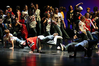
This picture is an example of the Hip Hop dance
culture. The clothes that the people are wearing
and the moves that they are doing is pretty obvious that it is Hip Hop.
The lighting is somewhat dark and the clothes are all different colours which stands out.
The camera angle is at a bit of an angle. It is not taken from the front of the stage, it is taken from the side, cutting some people off. The photographer was able to capture not only the people standing, but also the people doing the tricks on the ground.
The lighting also gives the composition, which I personally like because it is dark, but yet it highlights the colours and the lighting. This picture really gives a good and fun vibe when looking at it, which is something very good that the photographer captured.

Flamenco


This picture captures the Flamenco dance. The lighting is very basic. White background, which really makes the red dress stand out and makes the woman dancing the Flamenco stand out a lot more than if she were to be standing infront of a black or a bright coloured wall. The camera angle seems to be very basic. It is just taken from the front of the stage, but not very close. It was definitly taken from a distance, because we can see the feet and the arms, and above the arms a lot of space left.
I like this image because its very simple and very clear. There is no abstract way to try and figure out what she is doing. I also like it because it really shows character of the dance and what it is all about.


African
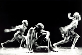

This picture represents an African style of dance. Obviously there are different styles of dancing in Africa in different tribes, but yet it is clear to see that this is African style dancing. The outfits compared to other dance styles really make it clear and definite. The lighting is black and white, but still highlights the movements and the attidue of the dance. It is nice to see the background black and the ground white. I think that plays a very big part in the picture. The angle is also a simple based forward angle, but yet you can tell that the person on the left is not on the same line as the person on the right or in the middle. The Photographer really took the picture from a forward angle, but then from the bottom. The fat that the picture is taken from the bottom really draws a lot of attention to the man sitting down in the middle, because its as if the viewer is down at his level. I like this picture a lot because I think it's nice that the main focus is not moving, but the two dancers in the background are, and we can really see that too.

Ballet
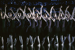

The fourth style of dance that I chose was Ballet. I like this picture a lot because of its lighting and the costumes. The clothes that the dancers are wearing are very simple and all the exact same, which makes the dancers become "one". This highlights their movements a lot more and their strong posture too. The lighting really helps too, it seems to focus more on the upper part of the body, which is another highlighter on the arms and the posture. It isn't only the upper part of the body that seems to have the focus, but also the lower part, concerning the legs and the feet. This lighting gives the effect of reflection in this image. The compostion is also very nice because there is a clear vision between the black and white, and where they are. This is a very nice picture and it was definitly the picture that I felt drawn too. Even though the dancers are standing still or are not doing any intense movements like the African dance picture, it still has so much power and has such a convincing vibe.

Modern
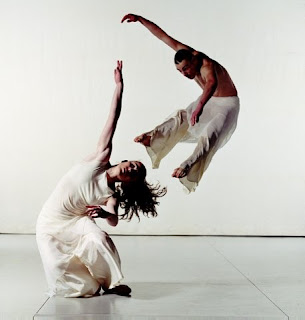

I chose this picture to represent my modern style of dance and I think it suits it perfectly. Modern dance in itself is a very complicated and hard dance to understand if one is not interested. And I believe that it can sometimes be hard to have the interest, and that the interest really depends on the culture and the way the person sees life. I like the the camera angle a lot. The way the dancers are dancing and the way the picture was taken really gives that feel that there is a story behind the image. The strong and direct arms of the female pointing up to the sky, and the male dancer jumping in the air while she is holding her pose. The way the picture was taken makes it clear that the male dancer is not jumping above her, but slightly behind her. The dancers seem to blend in with the background and the ground too, but yet the photographer was able to make them stand out somehow. Even thought hey don't stand out that much. I like this picture because I feel that it really tells a story. Modern dance especially is known for its "story tellings" and the fact that it was caught on a picture, I find beautiful.

Irish Dancing
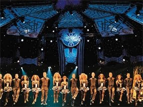


For my final style of dance I chose to do Irish dancing. It is a common dance and very cultural too. I like the picture, but it is not my favourite. There is something that the photographer which I didn't like. He/She just took the picture from an angle were the dancers are in the air, but we don't actually see the ground/stage. The back of the stage is so dramatic, it is as if not having the floor, doesn't complete it. The lighting is nice. I like the dark background and the focus of the light on the dancers. I think this also adds to a somewhat dramatic effect. I can't say this is a bad picture, but I personally think if the camera angle was different it would have been better. Yet I do think it is impressive that the photographer was able to capture that jump and have nearly every dancer be at the exact same height/level.


Dancers - Diary Entry

Dancers
Diary Entry

This project was fun to work on because we got to take pictures of people
that were moving. Personally apart from my experiences in the dark room etc.
I was not too happy when I was told that I had to be a model for the other students
in my class. I felt a bit stupid at first, but at the end some of the pictures that the other
students took, turned out pretty good :)

Everything went well in the dark and black room, except for one little thing.
I was struggling a bit with trying to get my contact sheet, because of the different shutter speeds
I used.
I was able to get my final print pretty quickly, which was nice.
Overal the experience was good for everything.

Sunday, March 1, 2009

Flash Unit 1 - Printing Compositions

Printing Compositions


Aperture: 4.5
Time: 5,10,12


This picture did not need a lot of time, because the more time that I gave it, 
the darker it got. This also meant I had to change my aperture a bit, to help with this situation.

Aperture:4.5
Time:8,11,14


In this picture it is very clear to see the contrast between the different times, 
which really helped me see what time was best for me.


Aperture: 11
Time: 20, 22, 24


With this picture there was a lot of white in it, and that is why I decided that for my final
print I would rotate the picture so I would get more of her face in, and less white.


Aperture: 11
Time: 20 


The original picture is not as white as the final picture. 
But is is very similar. 


Flash Unit 1 - Theory Notes

Theory Notes
Fill in Flash, Built in flash, Flash guide numbers


Fill-in-Flash

Usually the flash is used when there is not enough light. People usually don't use the flash during the day time because then you have the natrual light, and when it is used during day light it can make the picture over exposed, and it will not have a good composition. This is is when the Fill-in-flash is used.
Fill in flash is used when there is not enough light on a specific subject in the picture. Usually the fill in flash is needed when a person is taking a picture in a place with a lot of shadow and they need that bit of extra light, that the natrual light is not providing, to make their picture have a good composition.

This picture is taken without a flash, and as you can see, the face cleary has a dark shade, and it makes it hard to see the person's face correctly.


This picture is the same picture, but then it was taken with a flash, even though there was natrual light available.
As you can see, there is quite a difference in the lighting in the man's face, and the flash obviously helps, because it has given light in the subject's face.


Built-in-Flash

Built in flash has positive points and negative points in all. The built in flash is a very handy thing to have, and all digital camera's have it. Some of them will pop open and the others are already there.

This is a digitial camera with a "pop up" flash


Sometimes the flash can be too strong and can have a harsh shadows, so one thing that you can do is to diffuse the flash. To diffuse the flash all you have to do is tape a piece of small cotton on the flash, which will create a softer light.
One big problem that is often seen in many pictures is the Red Eye effect.
This happens because the flash tube is too close to the lense, meaning when a person is looking into the lense they have a lot of light shining on their eyes. This usually happens with compact camera's.


Flash Guide Numbers

Flash guide numbers are used to see what the exact exposure is when using a manual flash and when not having a flash meter. The higher the guide number will be, the higher the flash will be, meaning it will have more power than if it was at a low number. These numbers are also connected with the film speed, and that is what they depend on.


Friday, February 27, 2009

Flash Unit 1 - Image Bank

Image Bank


This picture was taken by Annie Leibovitz. Leibovitz started taking pictures when she was in the Philippines and later attended the San Francisco Art Institute. She started out writing plays and music, but later decided to go into photography. She has taken pictures for Disney and has taken many fashion portraits too. She has taken pictures for magazines such as the Rolling Stones. She is a very known around the fashion world and the photography world.

The reason I like this picture is because I like the angle of the lighting and the way it shines on the side of this face and not on his entire face. I love how the light really only shines on his face and on nothing else in the picture, except for a bit in the background.
It's a nice picture, even though it seems to have a bit of a depressing tone towards it, it still is very nice.


Flash Unit 1 - Diary Entry

Blog Entry

  Overall this project went pretty smooth when I was in the dark room.
It was very easy finding my time, seeing as it was very low, so when
I had to increase the time, I didn't have to go up to crazy high times
which is always hard to work with.
At one point I had a lot of empty space in the picture so I had to 
rotate my picture around to decrease the space.
Thankfully there was nothing very frustrating about working on this
project, which always makes a difference. 

Thursday, February 5, 2009

Assignment 6 February, 2009 - Image Bank

Image Bank


The Artist is William Gedney, who is known for
documentary pictures and narrative pictutres.
William Gedney was born in 1932 and died of
AIDS in 1967. His photographs are now all
known and famous around the world.

I choose this picture because it does have somewhat
a relation to my project. It is narrative in the sense
that it has the same "genre". It might not be an
actual story, but both of the pictures represent
a theme. I really like this picture because it occured
to me that in both pictures at least one person is not
visable, which I thought was very interesting.


http://photography-now.net/jem_southam/portfolio1.html

Unfortunatly I was not able to copy the picture that I wanted to
my blog, so here is the link to the pictures.

Jem Southam is a British Photgrapher, born in 1950.
He is a professer at the University of Plymouth.
He has written many books and has had a lot of exhibitons.
When looking through his portfolio, it is noticable what his
theme is. He tends to stick to landscape pictures.

The picture that I am talking about is on page 26 of his portfolio.
I like this picture a lot because it is two pictures of the same area,
but what it seems to be, is that it is at different seasons, or different
times of the day. I like this, even thought it is not an obvious story
it still has somes sort of a message behind it.


Assignment 6 February, 2009 - Story

Story
Rebecca in the Cafeteria


Becca, a senior high school student, decides to go to the Cafeteria to get
something to drink because she just had her Physical Education class and she
is very thursty. Becca walks into the cafeteria and stands in front of the "fridge"
for a little while, wondering what drink she should get. When the decision is finally
made, she makes her way over to the counter to pay, but she gets tripped by
another high school student, who thought it would be funny to see another student
fall. Obviously there is no point continuing the story, seeing as it lead to some negative
consequences for Becca and the other student.


Assignment 6 February, 2009 - Diary Notes

Diary Notes

This project went overall pretty alright in the dark room and in developing seeing as
all of the pictures were basically the same times, which really made a difference in
getting things done in time.
The only trouble I had was that my last picture was very blurry and I did not have
a back up, so I had to do with the blurry picture. Obviously I am not very happy about it
seeing as it has a negative reflection on my work, but apart from that, I was overall happy.

Another hard part was thinking of a story, and thinking of something exciting.
Which lead to my "interesting" story which took place in the school cafeteria.
So it did not turn out as exciting as I had hoped.

Saturday, December 13, 2008

Claustrophobia Image Bank

Claustrophobia
Image Bank


This picture was taken by the photographer Thomas Barbey.
Thomas Barbey is an American photographer who moved to Switzerland at a very young age. After he stopped university he decided to go into the Music world. He was a hit in the Italy and worked with many other people. It was not untill the 1990's when he started a Fashion studio. He does a lot of travelling and his inspirations are Rene Magritte and others.

I really like this picture. I think its so amazing, the way the hand holds the city in its palm, and it is as if the city is made out of sand, meaning that it could crash any second. I feel like this relates to this project because even though this is a city, imagine being surrounded by something and it could just "kill" you in any second. Its overwhelming, and just looking at it makes me feel like I'm in some small little place.

Image Bank # 2


This is my second image which is taken by the photographer Andre Kertesz.
Mr. Kertesz was a Hungarian photographer who probably should have gotten more recognision when he was still alive. He is now a lot more recognized than at the time though.

I love this picture and I also hate it at the same time. The reason I like it so much is because it is so random...A bunch of chairs put together in a park is definatly not something you would see everyday. The reason why I don't like it is because its too messy for me, and that is what makes it claustrophobia to me. I do not mind when things are scattered, but now it just looks messy.


This picture was taken by photographer named Elad Gutman. He was born in 1980 and he is from Israel. He used to be in the Isreali army and was in the photo unit. He then later became a fashion photographer assistant for a short period of time. He now does a lot of freelance, and he gets a lot of oppertunity to travel the world.

The moment I saw this picture I thought it was really good. The first thing I said to myself was "wow" and then i realized how uncomfortable it made me feel. I love being in big cities and having people around me...being alone in the middle of nowhere scares me, but this picture really gave another twist to loving the city and all the people. I feel so claustrophobic when I look at this picture, and I am definatly glad I'm not apart of that crowd. All the pushing and shoving around...? No thank you.


Claustrophobia Printing Compositions

Claustrophobia
Printing Compostions


Aperture: 2.8
Time: 28 seconds


Aperture: 2.8
Time: 120

This picture was scanned in, so I was not able to include the actual whole picture.


Aperture: 2.8
Time: 135


This is the test strip for the picture above.

Aperture: 2.8
Time: 40, 50, 60


Aperture: 2.8
Time: Do not remember the exact time but it is around 140 seconds.


Aperture: 2.8
Time: 70, 75, 80


Aperture: 2.8
Time: 120


Claustrophobia Theory Notes

Claustrophobia
Theory Notes

Picture 1

The first picture that I took was from a class mate and my teacher's daughter. I know I had to convince the teacher to let me use it for claustrophobia, and so this is a perfect chance for me to explain why. Almudena is holding the little girl in her arms, and behind her we can see some sort of gate. This picture does not make me feel claustrophobic, but the setting and the looks of the "models" make it seem as if they are the ones that feel claustrophobic. Some people could interperate this picture as if the two people are scared and afraid, which is technically correct because if a person is feeling claustrophobic, they usualy don't look very happy.
When I was taking this picture, I really tried to take it at diffent angles, but I decided to just go for the direct angle, so their feelings would not be "hidden". I also really tried to get the bars in the background to try and give that feeling of enclosure. If the bars would have not been in the picture I don't think that it could be considered as claustrophobia.

Picture 2

The second picture was of another classmate of mine. She was sitting under a small little table. I asked her if she could somehow represent a look of fear, or being able to look scared, and so I tried to use her facial expression the best I could. I did not take this picture at a direct angle like the picture I described earlier, this time I decided to go for a bit of a different angle, which I think made the picture a bit more dramatic. I'm also very glad that I was able to capture the wall and apart of the table, so it is a bit more clear to see that the model is in a small space. In this picture I also made sure that the model was not looking at me, which made her seem more distant.

Picture 3

This picture is quite different from all the other pictures that I took. In all my other pictures I had people to represent the claustrophobic feeling, but for this one I decided to use objects. This picture is a bike shed full of bikes. They are all the same kind of bikes, they are all the same size, and they are all in the one row in the same position. You can also clearly see that they are in a bike shed which adds that more enclosed feeling towards the picture.
Bikes do not generally make me feel claustrophobic, but when I see things, which are all the same in one little small location I do feel a bit overwhelmed. This particular picture does not make me feel that claustrophobic, but I do feel some sort of enclosure. This picture was also taken from an angle which ended up being a side angle. I think in this case taking the picture from a side angle does have a bigger affect, because when I looked at my negative I had a choice of taking this picture or a picture without the side angle but with just a direct look, and it was very obvious to me which one I wanted to use for this project. Something about the direct shot made it feel like a " so what" picture, and it really did not have any affect, and it didn't even look good.

Picture 4

This picture is taken of a little girl, who is looking straight at the camera and it gives the picture such a dramatic effect. This little girl is behind some sort of a wall or little fence, and she has her hands resting on the little fence which makes it seem as if the little girl is trying to get away, and trying to escape from the area that she is in. When I was taking the picture I wanted to include the wall so it would be easier to see the child's surroundings. Now that I look back at my picture I imagine the same exact picture with a different model, someone older like an adult, the picture would be so much different and it would not have the same effect. I think when taking a picture of claustrophobia it is important to keep in mind who the model is.

To see all the pictures you can look at my Printing compostitions.


Claustrophobia

Claustrophobia
Diary Entry

This project went overall pretty good. My experiences both in the dark room and in the black room were good too. I actually forgot my camera, but I was able to borrow someone else's which was a great help. Most of my pictures came out good, even though all the ones that I used for this project needed some convincing and needed some clarification why they represented claustrophobia.
I was pretty lucky in the sense that most of my pictures were around the same times, and I did not have to wait too long to figure out the times. I was also lucky in the sense that I did not really get any pictures that were grey, which was great because I didn't have to use a filter.

Thursday, November 20, 2008

Printing Compostions (3)


Printing Compositions


This picture has an aperture of 2.8 and because the negative was so dark i had to have the time of 45 seconds. As you can see, the pictures that are circled are the three pictures that I choose.  This was my first contact sheet, which was also the best.

This is my second contact sheet, and it has the aperture of 2.8 and the time was also 
45 seconds. Unfortunately these pictures did not turn out because the background was not very good, and a lot of these pictures seemed to be rather blurry. 


I did not have many test strips but here I will display 2 ( I was not able to get my test strip for my third picture.)

The time is 70, 75, 80, 85 and the aperture is 2.8
This picture is rather grey, so when I did my full and final print, I had to go a lot higher with my time to try and really get it darker. The final result was that it turned out darker, but was still grey.


The time for this test strip was 100, 110, 120. The aperture was 2.8, and because it was also very grey I added a filter of 3. This did help a little  bit, because in the final print I was able to see the black a lot better. In the final print I did go higher in time. 


I only had one medium size picture of one of my full prints, because the other ones were thrown away by accident. The time was 145 seconds, and the aperture was 4. This picture still to me feels too grey, but there was not much I could do more. The white does stand out in the picture, but not enough to distract it from the grey colour in the picture.


Wednesday, November 19, 2008


Image Bank

Number 1

There is something I really like about this picture. It feels so real. Having a famous person looking at their own picture in a magazine. I love the expression, and the way it really captures the reaction, and it seems so real. I does not feel as if the model was put in a room, with a bunch of lights around her. It feels as if it would just be any other picture. Seeing as our project is about "hair" I thought it was cool that the models hair was such an " out of bed look". It really added that extra "reality" to it.

The artist is Terry Richardson, who is a well-known photographer in is generation. He started out in high school and since then he never stopped. He has photographed for magazines such as Harpers Bazaar, British Vogue, French Vogue; he has worked with people such as Leonardo DiCaprio, Pharrell Williams, Justin Timberlake, Kanye West, and many more.


Number 2

I really like this picture. It somewhat reminds me of the setting of one of my own pictures. I love the facial expressions. I also really like the lighting (also the contrast) and the way it shins differently on the two people, even though they are so close to each other. I also find it interesting that the fist think I personally noticed was the hair, which connects with our own project.

The artist is Autumn de Wilde, who is known for taking portraits of a lot of celeberties. There is not much information on her, other than she is an American Photographer, and she was born in 1970.


Number 3

The moment I saw this picture, I really liked it. The way the picture is taken with the light is so different than most other portrait photographs. I love how the light shines on one part of the womans face, and then the other part is still visable, but a lot darker. I personally really love this picture, and the angle that it was taken at. The way it was taken from such a close distance, but yet not direct in the face. The face is at the side of the photograph and not in the middle.

The photographer is a dutch woman named Carla van de Puttelaar. She is a well known photograoher. She has also won many different types of awards for her work. When looking at her photographs, we mainly just see pictures of woman and most of them are in the nude.


Theory Notes (3)

Theory Notes


Flashes:

"A flash is a device used in photography that produces an instantaneous flash of artificial light (typically around 1/1000 to 1/200 of a second) at a color temperature of about 5500 K to help illuminate a scene."
Usually flashes are used to illuminate a picture, or to capture moving objects such as this running water.


This running water was captured by using a flash.


There are definatly different varities of flash such as electronic, flash-bulbs, and flammable powders.


This is an example of a flash that has to be added to the camera.


Usually flashes are used indoors, seeing as the photographer will naturally not have the same light as if they were shooting outside.
There are different techniques that can be used to use the flashes inside. For example a lot of photographers will use something relflexif, such as a flash umbrella. This method is called bounce flash, which gives a much more natural type of flash, than if just a flash pointing straight into somebody's face.
A lot of time people with digital camera's will have some problems with the flash. This is because the built in flash is not that strong, and it can only be used for certain distances. If the flash doesn't work out, the pictures might turn into some sort of grainy photo.

Light Meter
This is a device which is used to measure the amount of light.
A lot of photographers use this, and will use it with a computer to be able to determine which shutter speed would be best to use, or which f-number should be used.

This is an example of what a light meter looks like:


There are also different ways to calculate light with equations such as these:

For reflected light meters -


For incident light meters -


These are just some equations.